Lyric Guessr

Lyric Guesser was a game of guessing which word appears in more hit songs.
Users could submit guesses for pairs of words submitted by other users or create their own submissions.
The front-end was created with React and the back-end with Express and MongoDB.
The lyrics were sourced from Billboard's charting singles using Python and the Genius API.
Great British Accent Challenge
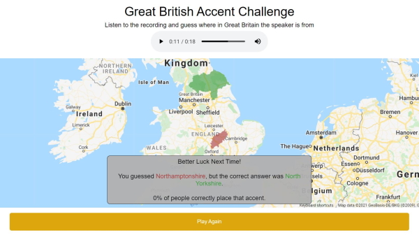
Great British Accent Challenge was a project inspired by GeoGuessr. Users listen to a short audio clip of a speaker
and attempt to guess where the speaker is from. After guessing, the results displayed how many users correctly
selected the speaker's location.
The site was created using Python and Django and the Google Maps API with JavaScript. There were around 100 audio clips stored
using AWS S3. The site was deployed using AWS Elastic Beanstalk.
Audio Visualizer - Chrome Extension
My audio visualizer Chrome extension creates a 3D visualizer for the audio from a tab. When the chrome extension icon is clicked,
the tab's audio stream is sent to the visualizer, using tab capture.
I decided to use the visualizer part of the project to learn Three.js. The audio stream is analyzed by the Web Audio API,
and the data is used to animate objects in Three.js.
Formula 1 Elo Engine

My Formula 1 Elo engine was a way to rank Formula 1 drivers by comparing head-to-head matchups. The engine assigned weights to qualifying
position, finishing position, fastest lap, and number of positions gained or lost during a race.
I used Python and Matplotlib to create an animated graph that shows the Elo rankings of every driver over time.
Trump Content Warning - Chrome Extension
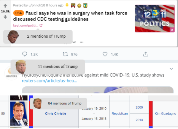
To continue learning about making Chrome extensions, and to help me avoid reading too much news focused on Donald Trump,
I decided to make an extension that previews links and displays a popup to warn you if Trump's name is mentioned.
When the cursor hovers over a link an ajax call to the page is made, and the number of Trump mentions is displayed in the popup
next to the link. The photos inside the popup correspond to the number of mentions.
City Connections

This project organized city populations as trees by connecting smaller towns and cities to their next nearest larger city.
The visualization shows what cities are the most dominant in a region.
The data was sourced from U.S. Census data and visualized using JavaScript and PolyMaps.
NBA Predictor
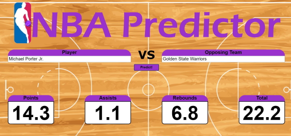
NBA Predictor receives an NBA player's name and an opponent team and makes a prediction for the player's
points, assists, and rebounds. It also includes sliders to adjust the weight given to different variables
used to make an estimate. Player and defense stats are collected using ajax calls to ESPN and TeamRankings.com.
Professional Athlete Map
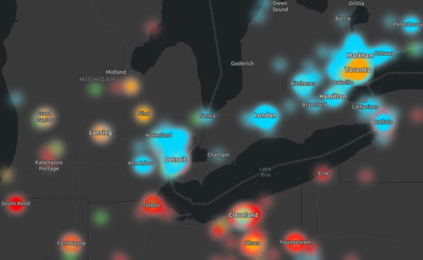
I collected the birthplaces of professsionial athletes from the NFL, MLB, NBA, and NHL using ESPN's API and Wikipedia. Each birthplace was
geocoded using GeoPy and then saved in csv files. With the ArcGIS API for JavaScript, I created a heat map of where professional athletes
were born. When zoomed in close, the map changes to a simple point map so that points can be clicked to find out which athlete they represent.
Coding Game
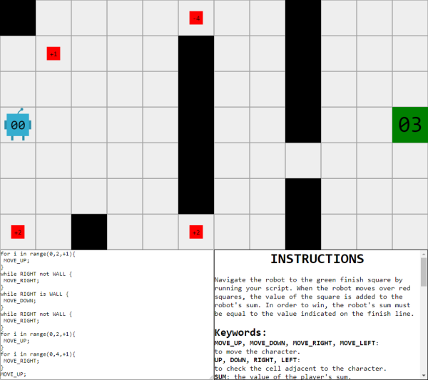
The coding game is a simple puzzle game in which you solve a puzzle by scripting the movements of a robot.
The script written to move the robot is similar to Python with some modifications.
The goal of the game is to move the robot to the finish square after acquiring the correct sum.
When the robot passes over a red square, the red square's value is added to the robot's value.
There are three levels to solve in any order.
US Church Map
I used Python to gather addresses and denominations of churches in the United States and then geocoded them using GeoPy.
This data was turned into csv files for each Christian denomination. With the ArcGIS API for JavaScript, I turned this data
into a heat map. Layers can be toggled on and off to view each denomination seperately.
US Cities Population Map
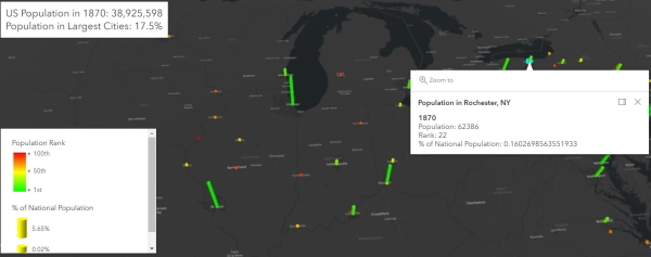
To continue using the ArcGIS API for JavaScript, I mapped the most populous cities in the United States since 1790.
I used data from the Census Bureau and then cleaned it up using Python.
The map displays each city's share of the total national population as well as its rank. I also added info popups
that appear when the base of the graphic is clicked.
3D Ray Marching
I used ray marching and signed distance functions to draw a scene onto an HTML canvas using JavaScript.
The scene is lit using diffuse lighting and includes shadows. I implemented signed distance
functions for a sphere, a box, and a plane. The lightsource rotates slowly around the scene,
but with three objects, the scene runs very slowly.
2D Ray Marching Visualization
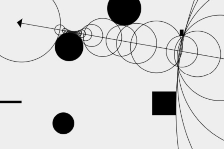
Before rendering a full 3D scene using ray marching, I created a 2D visualization of sphere tracing.
The canvas displays the circles that represent the ray marching steps leaving the "camera."
The camera can be moved around the scene, and clicking adds a random shape.
Crossword Maker
This project allows you to create a crossword grid and then attempts to fill it using words taken from Dictionary.com and
Wikipedia article titles. Custom words can be typed into the crossword before the rest of the crossword is filled.
Unfortunately, pulling from such a large pool of possible words creates many crosswords with obscure words and acronyms.
Words were collected using Python and Selenium, and the crossword is created and filled using Java.
Mapping Google Trends
Google Trends limits the number of comparisons to 5 search terms. I wanted to make a visualization of sports teams based on
Google search popularity, so I used Python and the Pytrends API to compare all teams in a league to each other.
I used this project to create maps of NFL, NBA, NHL, MLB, and MLS teams in the United States.
Binary Tree Signatures
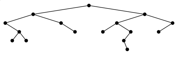
This project creates a visualization of binary trees. Every binary tree has a unique signature created by a pre-order traversal.
Each node is represented by two decimals. The first digit represents a left child and the second represents the right child. For
example, 01 represents a node with a right child, but no left child.
Trees can be constructed by clicking on the nodes or by entering a valid binary tree signature in either
decimal or binary representation.
Harry Potter Sentiment Analysis
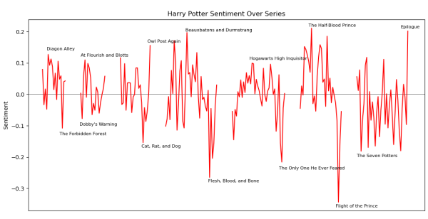
I used Python and VADER to analyze the sentiment of each of the Harry Potter books. I collected the average sentiment for
each chapter and plotted the results using Matplotlib. I labeled the highest and lowest sentiment chapters of each book.
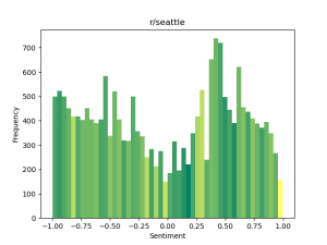
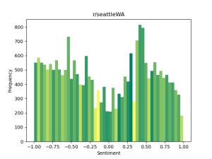
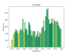
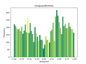
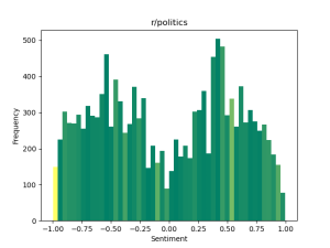
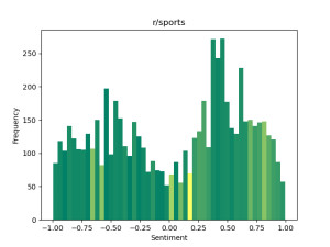
Subreddit Sentiment Analysis
I wanted to compare the sentiment of different subreddits and see what kind of comments attracted upvotes. I looked at
subreddits focused on the same subject, such as r/Seattle and r/SeattleWA as well as r/Canada
and r/OnGuardForThee. For more of a contrast, I also compared r/Politics to r/Sports.
I used the Reddit API to collect comments from top posts on a subreddit and used VADER to analyze the sentiment of each comment.
Using Matplotlib, I made histograms for different subreddits based on the frequency of comments with similar sentiments and
colored each segment based on the average number of upvotes for a comment within that segment. The dark green segments are the least
upvoted, and the yellow segments are the most upvoted.
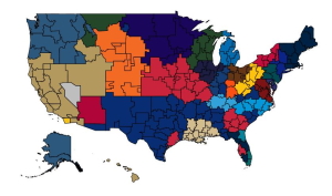
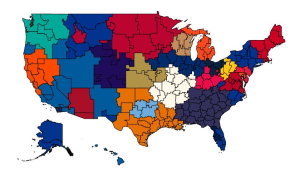
College Football GIS
I wanted to learn how to make maps using ArcGIS, so I used the ArcGIS API for JavaScript to
map the college football champions since 1869. I used the data from the College Football Data Warehouse's list
of recognized winners.
Each school's bar grows based on its weight, and its color fades to red based on the number of years since
its last win. The green dot represents the weighted center for national champions. I assigned each year a
weight of one and evenly divided it between the year's winners.
Solitaire AI
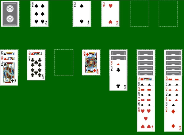
This project was created after learning that a skilled solitaire player wins around 43% of games. I attempted to see what percentage
of games of solitaire a simple AI could win. The AI I created is capable of winning games, but not as many as a skilled human!